Illustrating Ben Harper..

blog1

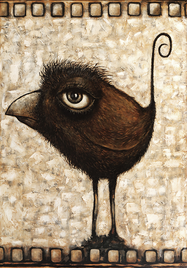
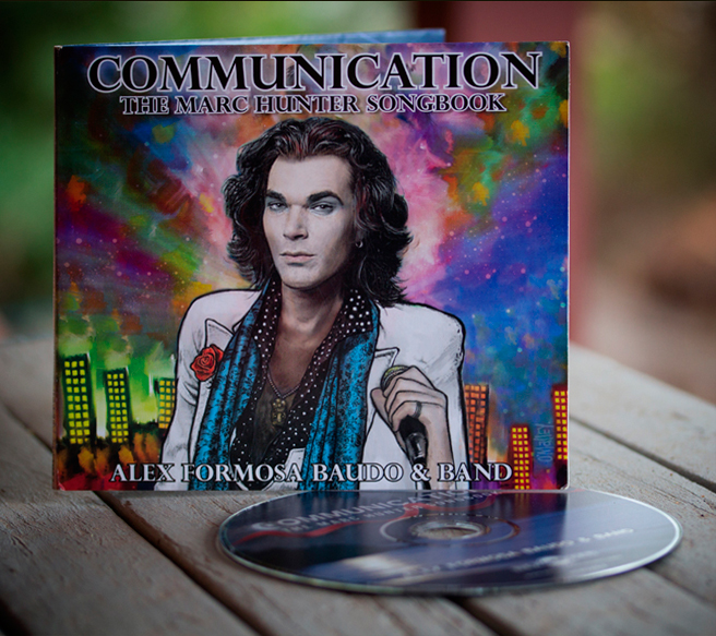
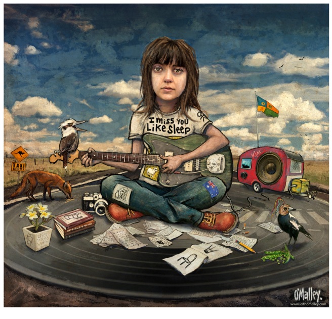
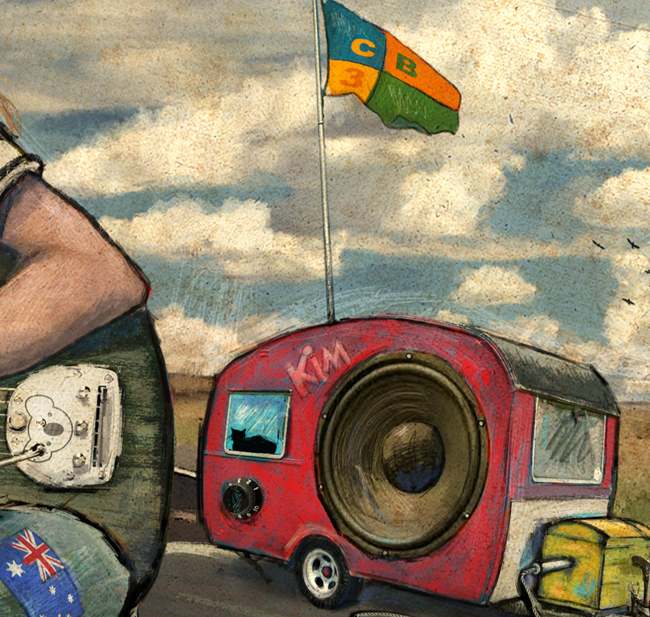
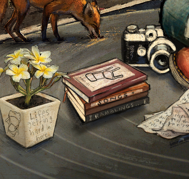
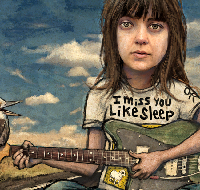
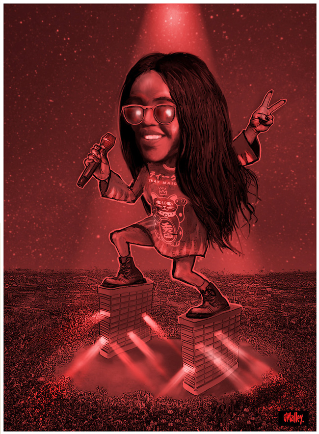
Call it what it is.. illustration.

I’ve kept a keen ear on Ben Harpers music for a few years now. Not to the point of buying each new release, but being aware of it.. listening in and observing his rise and rise online, in music magazines and tv. In a way like travelling on a Melbourne tram.. jumping on and off at various points along the way and enjoying the experience.

That said, I did take a long enjoyable ride with his previous album “Get Up” which saw him partner up with an old favourite of mine, blues man Charlie Musselwhite.
As a side note I got to meet Charlie during his last Australian tour. He signed one of my chromatic harmonicas after a show in Adelaide. Unfortunately I recently very foolishly erased that bit of marker history, by applying a charcoal fixative spray over the signature. Real dumb move O’Malley.

blog2

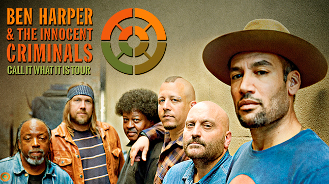
Anyway, listening to that album from Ben and Charlie gave me further insight into the authenticity Harper brings to his music. The new album marks the return of his band “The Innocent Criminals” after a long hiatus, cooking up a collaborative mix of infectious tunes.

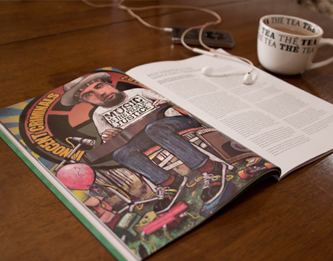
Time marches, on and in serendipitous fashion I recently welcomed the opportunity to illustrate Ben Harper via a commission for the Australian music magazine “Rhythms”.
I tend to spend a fair amount of time researching the subjects I illustrate or paint and many of the interesting things I discovered about Ben Harper were included in the finished illustration.

The internet is a good resource. I ended up watching a ton of his music online, and spent several hours also watching or reading the many interviews available.

Bens website, Wikipedia and the trusty Google images also served as handy guides for referencing some of Bens physical characteristics, along with getting some sort of take on what to include in the drawing to personalise it a little.
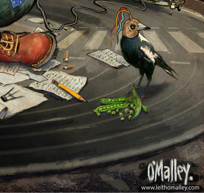
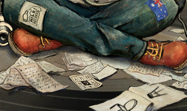
The T-Shirt slogan in the picture for instance, comes from an interview I was reading.. it was just something Ben said at the time. I liked the sound of it and it speaks to what he is all about. To me anyway.
The pink balloon is topical and is simply a reference to the first single release lifted from the album. I have included several charity or activist logos throughout the drawing, all of which Ben supports and contributes to.
He has always been a keen skater so the board was always going to make an appearance. It’s supporting the only real dark imagery of the drawing actually..  and the message behind  the title track “Call it What it Is”. That of a dark figure as a gun target on the speaker mesh of the guitar amp. “Weissenborn Wailer” incidentally, is both a metaphor for (Bob Marley and the) Wailers and also a sliding nod towards Bens almost trademark guitar and sound.

blog4

I was happy with how it turned out and the editorial staff at Rhythms are a joy to work with.. having given me pretty much all the creative freedom I wanted in coming up with this concept etc.
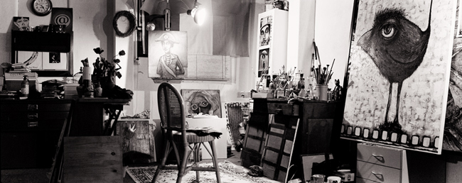
As mentioned previously, the process of mixing natural media and the digital platform is something I always enjoy. I generally like to scan a charcoal layout into the computer, work on that for a while.. print the resulting drawing out and then feed it right back in.
The illustrating and fine tuning from there on in is fairly intuitive, once I have some sort of pictorial framework mapped out.

OK, I better make a move.. glad you stuck around for my ramblings here. Feel free to comment in the feedback box at the bottom of the page.. would love to hear what you think..
Another thing, try and get hold of the album if you can (“Call it what it is” by Ben Harper & The Innocent Criminals).. it’s magnificent. and I’m looking forward to his tour of Oz later in the year!


COMMUNICATION

Newmarket Records of Melbourne have just released “Communication” a CD celebrating the songwriting and music of the New Zealand musician, the late and eternally great Marc Hunter.

blogpic1

The project is the brainchild of musician “Alex Formosa Baudo”, an old friend of Marcs who has also been staging memorial live shows in Melbourne over the last few years in honour of Marcs mateship and his contribution to the Australian recording industry.

These live events have included a rotation of well known Australian musicians, all banding together in a virtual all-star group to put on a night of heady Hunter rock and roll and heart felt ballads. The shows were/are presented at various Melbourne venues, including the iconic Espy Hotel in Saint Kilda.

blogpic2

I connected with Alex through a mutual love of Marc Hunters music and that of his band over the years “Dragon”.

Albeit borders apart (he in Victoria, me in South Oz), it has been a labour of love helping to promote the live events through the creation of various posters, video and promo images.. some of which even ended up being used in projections at one of the live shows.

blogpic3

One particular image from the series of posters graces the front cover of the album “Communication”.

The illustration started out as a mixed media combination of photographs, traditional media, hand drawn plus painted elements, digital collage and some big city chalk.

blogpic8

I used a process of multiple scans, manipulation, rescanning, ink/paint embellishment (notably the background city scape) and then returned the whole thing into PhotoShop for additional digital effects with a few final tone adjustments. I was very happy with the result and thankfully so were many fans of Marc and those close to him.

blogpic4

As things turned out, I ended up designing the whole layout for the CD.. front, back, inside sleeve and the imagery on the CD. Alex OK’d my concept for the inner sleeve, which referenced the red ribbon or tape used in the original music video for the song “Communication” and which Marc featured in. I also edited the photographs used on the album, made some specific font choices and colour corrected for print on completion.

blogpic5

I’ve mentioned before how I love mixing art and music. This combined with my love and respect of Marcs music, became a project I was more than happy to have contributed to. It’s also a little surreal seeing my name on the same acknowledgement page as several great Australian musicians.

blogpic6

Sitting on a couch in my lounge room typing this post and listening to the Communication album, I am reminded of the very reason I ended up putting brush, stylus and pen to paper not so long ago.

I’m looking at a black and white picture hanging on a wall at the end of the room. It’s a large oil on canvas portrait of Marc Hunter which I painted long before all of this interstate communication with Alex began. It’s a comforting reminder to me of how music can inspire art. How words and instrumentation can fuel another form of creativity or means of expression.. in essence the love and joy music brings to ones life. I’m fortunate to have been a part of that.

So a toast to one of the good guys. No Fiji Bitter on hand but some fine wine will suffice.

It’s Celebration time..

blogpic7

Related links:

“Communication” Alex Formosa Baudo at Newmarket Records

“Communication” Alex Formosa Baudo on Itunes

Preview Alex Formosa Baudo’s “Communication” on YouTube

Marc Hunter Facebook Page

The Dragon Facebook Page

Rock Club 40 review of the Communication live show at The Flying Saucer

“Are You Old Enough” on YouTube – Alex Formosa Baudo

Mick Pealing – “Still in Love with You”Live

Some Videos of Marc Hunter:

Marc Hunter – Southern Cross

Marc Hunter – Night and Day

Dragon – Wilder World

“Are You Old Enough” Dragon with Rene Geyer (Incarnations album)

Dragon – Rain

Sometimes I draw and paint, and sometimes I just draw ..

[On illustrating Courtney Barnett]

courtney_barnett_omalley2016

I was driving when I first heard her.  

I remember thinking how much the song reminded me of The Velvets, and the memories of travelling that same outback highway at night many years before flashed through me in sync with the oncoming truck lights. Road kill also flashed by. No dead fox, but more than a few kangaroo carcases. 

In fact, those poor roos had more life in them than most radio stations at the time, so hearing authentic Australian music for a change was a nice surprise. Especially knowing my attention span.

As an artist or image maker, I often have to put a reign on myself when it comes to music. I get a little caught up in the fascination of finding something new and interesting. Off I go on a tangent, immersed in the intoxicating pleasure that new audio brings.  It can easily influence you into being distracted creatively from what you had intended to do “next”.. and I have so many “next” things to get on with.

Anyway, I ‘m never good at listening to my own advice.

blog2

Fast forward a week or two (via youtube interviews, music videos and album downloads) and I have now well and truly soaked myself in a lot of Courtney Barnetts music.

People who know me, know that as much as I like revisiting music and art of the past, I really love popular culture. I’ve simply never subscribed to the view that the best art (and I include music here) all happened in the past. That makes no sense to me.

Exciting music and art is all around us right now as it was then. It always will be.

Some of it is very accessible and some I have to dig around a little to find. It doesn’t have to be on radio or a screen either. Sometimes it creeps up on you in the most unlikely places.. and having an open, unsuspecting frame of mind is always the best place to be when it arrives. 

That’s how I found Courtney.. or her music found me. 

Despite all the amputation, you could dance to a rock ‘n’ roll station.. and it was all right.

blog3

It’s the same with visual art or imagery.. there are so many acontemporary artists, illustrators, designers and photographers around at the moment. It’s a humbling experience looking at so much of it online. Virtually unknown individuals of all genders and race are putting out incredible art!

I mentioned fascination.

That’s the seed to what eventually became a somewhat whimsical illustration.

As with music, I don’t see a great distinction between the past and present mediums as far as visual art goes.

I love jumping from painting on a canvas to painting on a screen.
I don’t buy into the sacrilege of art and all that bullsh*t. Whatever road gets you there is the only one I’m concerned about. Both mediums (traditional and digital) are exciting and different. Different, but the same.

People always get surprised when i tell them about how much I have improved my traditional painting skills through working digitally. I think that’s for a future blog post though.

blog4

For now, let’s get down to some nuts and bolts..

The image is a combination of collage, drawing, painting and subtle photographic filter effects. For my digital illustration work I use a Wacom tablet (with stylus) and a combination of software including Adobe PhotoShop and Corel Painter. Loose leaf tea or wine, but never at the same time.

Courtneys song writing is so full of interesting visual imagery and I think avant gardeners (I mean avid listeners) will recognise the references I have included in the image culled from different lines in her songs. Oh, except the magpie with the falconry headgear.. that bird flew in from a previous touring exhibition series I did  (based on the explorer Edward John Eyre). What can I say, I like birds.

blog5

In my research for the illustration I also listened to quite a lot of interviews.

For instance, in one discussion Courtney mentioned she would love to own a forrest green Fender Jaguar guitar, in another she and her group talk about their love of vinyl (records). So I thought I would set the scene with her playing that guitar on a vinyl record. Oh and sitting of course.. which she sometimes likes to do.. and think apparently 😉 

Look, I won’t mention all the references but you get the drift..

blog6

So there you have it, a new piece from me, the first for 2016 and one which I very much enjoyed doing.

I’ve employed a few of my own PhotoShop brushes throughout, and changed my mind several times about certain compositional elements. There’s something to be said about having time away from whatever it is you are creating.. a sort of time out… and this allowed me to make (what I think) were the right decisions as far as how the illustration eventually turned out.

Ok, have a Happy New Year everyone and hopefully this ramble will encourage a few of you to have a listen to the music of Courtney Barnett. If you want to leave a comment for me then scroll down the page. I’m also on a bunch of social media sites (listed on my website ).

In the meantime here’s a taste..


* note: the illustration “Courtney Barnett” is currently unpublished and is the copyright of
leithomalley.com (but just disregard that and share the hell out of it).

————————————————————————-

About the Author:

meeeee


Damn I hate writing this stuff but here goes.
I am a South Australian artist/image maker and love to work in various mediums (drawing, oil, acrylic, ink, pastel and mixed media) as well as utilising digital imagery, graphic design, photography and video.

My drawing practice was initially influenced as a young boy by the illustrative style and cartoons of Mad Magazine before having my mind blown later by the work of Robert Crumb, Goya, Michael Leunig, American illustrator Rick Griffin and Australian illustrator/ cartoonists like Bill Leak, Michael Leunig, Reg Mombassa and Shaun Tan. 

I  maintain a very active studio practice that includes a lot of procrastinating and then a little time creating solo work. I have participated in group shows within Australia and America and own a half fox terrier/half chihuahua named Lizzy, but I like our two cats better.

What else….  a few months ago I was commissioned  by The Benetton Foundation in Italy to paint a small work for their Imago Mundi Contemporary Australian Collection. The book of the collection will be out early February 2016 and there are plans for the collection to begin a tour in 2016.

To be serious for a moment, I should say there is a close nexus between my studio artwork and the commissions undertaken for corporate and publishing clients in Australia, Europe, and America.

A life-long love of music (I play in a band), has also led to prestigious graphic art commissions for music festivals, in Australia, Russia and America.. along with various CD/poster designs and magazine illustration and cover art.

I  am represented by the following galleries who are all probably wondering when the hell I am going to send more canvasses:

  • Dallas – Ross Akard Gallery
  • Sydney – Francis Keevill Gallery
  • New York – Charlatan Ink
  • Melbourne – Smart Artz Galley
  • Adelaide – Geoffrey Stapleton Gallery

——————————————————————————

If you would like to purchase any prints or original artwork please click this image for contact details:
omalley2

Click on this text link for info about limited edition prints for Sale 

She wears tall boots. U-Huh.


[Musings on the Tkay Maidza ilblog1lustration]

I used to draw spot illustrations for an Adelaide music magazine years ago along with weekly cartoons for a regional newspaper. It was a lot of fun.. the drawing part, but not the deadlines.

Cartooning requires an antenna for exaggerating the obvious. It’s a super power I still carry with me and is a neat trick in helping steer anyone looking at a drawing to recognise who it is they are looking at.

I know Tkay Maidza’s parents. They used to live in the same city. Gifted people in their own right and very musical minded.

I met Tkay on only a few occasions but she was a young school aged student at that time and making quite a name for herself in sport, namely the tennis court. Now of course she is making a racquet of a different kind in the world of hiphop.. holding serve recording, grand slamming music awards and touring the world circuit.

blog1a

I have a vast appreciation (aka consumption) of all kinds of music and although not as well versed as many in hiphop, I know a little about the genre and certainly own a few records (CDs). My favourites being the Jazzmatazz albums of Guru (founding member of Gang Starr) and an old album that Miles Davis worked on just before he passed called “Doo-Bop” with Easy Mo Bee. These days you can’t turn on the radio without hearing a hiphop track or at least music influenced by it. Like every form of music played (relentlessly) on radio.. there is good and bad.

Family connections aside, Tkay’s own brand of hiphop sounds good. Very good.

A young woman with the ability to shoot words, rhythm and rhyme out like an AK47 is destined for success. It’s also really heartening to see her being recognised by many for her individual style.. which I imagine is a hard thing in the “chew them up, spit them out” machine that is the music industry. She stands out, just like those boots.

Ok, let me switch lanes for a moment and put on my graphic arts hoodie.

blog2

I alluded to cartooning earlier right?

Apart from being interested in the music and career she began carving out, one thing that sparked my interest in creating an illustration of Tkay was seeing a lot of photos of her performing on stage and on video.

The boots she wore and still wears.. struck me as quite symbolic and individual.

I had this image in my head of her soles towering from a stage.. a reference of her own growing status in the music industry.

When I eventually created a thumbnail sketch on paper, I could see how the platform soles could be exaggerated into looking like skyscrapers or residential blocks of a city.

So that was the impetus really, right from the beginning. She wears tall boots.

From the initial sketch on paper I went straight to computer.

Using a digital palette and my standard tools (a Wacom tablet plus stylus), the illustration started out as a simple line drawing which I built up via charcoal.

Well, I say charcoal but it’s actually a digital charcoal “brush” which I created in PhotoShop. The “brush” mimics the look and feel of real charcoal and I actually  feel as if I’m drawing on paper or canvas just as I do with traditional media in my studio. In fact,  I sometimes lay a sheet of thin textured paper over my tablet to enhance further the feel of working on art paper. It also helps to “slow” the action a little of the stylus if that makes any sense.

blog5

From there I continue to think about additional digital collage and a lot of artistic licence. I completely made up the look of the dress for instance, although one of Tkays own motifs has been added to the front of the dress.

I drew and painted much of it with a M.O.B {Multitude Of Brushes} and took my reference of Tkays face from a combination of different photographs and adding the sunglasses towards the end.

Without getting too technical, there are also various layers that make up the illustration during the process prior to the flattened completed version(s) seen here.

These layers contain various elements or stages of the image as I progress.. making it easier to enhance, add, delete or make colour and tone adjustments as I go along. The solo spot light was a last minute addition along with the window light effects coming from the base of her platform boots.

blog3 blog4

STOP PRESS:

What a lovely gift I have received in the mail today! Thanks to Tkay and her family I now have a huge reproduction print of the illustration I created – hand signed by Tkay herself!

This will be such nice memory of the piece to frame and hang in my studio.

blog10

blog9]

Getting my hood on in the studio lol.. For Shizzle!

more information on Tkay visit tkaymaidza.com 

blog7

———————————————————————————–

About the Author:

meeeee


Damn I hate writing this stuff but here goes..
I am a South Australian artist/image maker and love to work in various mediums (drawing, oil, acrylic, ink, pastel and mixed media) as well as utilising digital imagery, graphic design, photography and video.

My drawing practice was initially influenced as a young boy by the illustrative style and cartoons of Mad Magazine before having my mind blown later by the work of Robert Crumb, Goya, Michael Leunig, American illustrator Rick Griffin and Australian illustrator/ cartoonists like Bill Leak, Michael Leunig, Reg Mombassa and Shaun Tan. 

I  maintain a very active studio practice that includes a lot of procrastinating and then a little time creating solo work. I have participated in group shows within Australia and America and own a half fox terrier/half chihuahua named Lizzy, but I like our two cats better.

What else.. a few months ago I was commissioned  by The Benetton Foundation in Italy to paint a small work for their Imago Mundi Contemporary Australian Collection. The book of the collection will be out early February 2016 and there are plans for the collection to begin a tour in 2016.

To be serious for a moment, I should say there is a close nexus between my studio work and the commissions undertaken for corporate and publishing clients in Australia, Europe, and America.

A life-long love of music (I play in a band), has also led to prestigious graphic art commissions for music festivals, in Australia, Russia and America.. along with various CD/poster designs and magazine illustration and cover art.

I  am represented by the following galleries who are all probably wondering when the hell I am going to send more canvasses:

  • Dallas – Ross Akard Gallery
  • Sydney – Francis Keevill Gallery
  • New York – Charlatan Ink
  • Melbourne – Smart Artz Galley
  • Adelaide – Geoffrey Stapleton Gallery

——————————————————————————

If you would like to purchase any prints or original artwork please click this image for contact details:
omalley2

Click on this text link for info about limited edition prints for Sale 

“The Trojan Horse [the ore price cometh]”

   omalley_colour
You know, as a young boy I was fascinated with the story of the “Trojan Horse” and marvelled at the illustrated images of it from children books to it’s depiction on old black and white movies I would watch on Sunday afternoons in front of the television.

troy

For anyone who is unaware, quick history lesson.. the Trojan Horse is a tale from the Trojan War about the subterfuge that the Greeks used to enter the city of Troy and win the war around 12th Century BC. In short, after a fruitless 10-year siege, the Greeks constructed a huge wooden horse, and hid a select force of men inside. The Greeks pretended to sail away, and the Trojans pulled the horse into their city as a victory trophy. That night the Greek force crept out of the horse and opened the gates for the rest of the Greek army, which had sailed back under cover of night. The Greeks entered and destroyed the city of Troy, decisively ending the war.

Fast forward to 2006 and I’m sitting having lunch in an old canteen room of a chemistry lab smack bang in the middle of a large iron and steel making plant. I’m eating sandwiches, looking out of a window and daydreaming about childhood.

Somewhere between the ham and cheese and the tuna salad I started thinking about that old Trojan Horse story and the analogies that could be made with the industry and town surrounding me. Food for thought right?

Anyway, before I knew it I was putting pen to scrap of paper and sketching out an image that I could never have imagined would resurface again years later in several incarnations, particularly as a large charcoal drawing and eventually an even bigger oil painting.

sketch

In the canteen on that day, over spilt bread crumbs.. I started reimagining the industrial giant surrounding me as that impenetrable steel horse, full of people I didn’t really know and how something.. at first appearing as a gift, might eventually become a threat to a community.

The hurried early sketch, the later charcoal and the current full colour painting come from that same place, that same feeling yet at the same time born from boyhood memory and wonder.

omalley_blackwhite

I’m not really one to wax lyrical about the philosophical nature or meaning of a painting, but I hope the viewer recognises and understands the underlying metaphor of the work, and it’s very real semblance to the situation this town and many others throughout Australia are currently finding themselves in.

detail2

Ok, my 2015 Trojan Horse is finished and it’s inclusion as a finalist in a $25000 art prize is even more heartening for me, especially as it’s audience are the very people that the painting was/is meant for. People who live in a place of dependence.. and that because of it or in spite of it their community relies on a nearby resource. In this case a resource industry that is in crisis mode where the world ore price is having such a significant effect on both national and regional economies, peoples livelihood and the ultimate wellbeing of their families.

man

For everyones sake I am hoping things change for the better. For now there is much waiting. Waiting for what will happen next.

—————————————————–

“The Trojan Horse [the ore price cometh]”

180 x 120cm. Oil on board

omalley_colour

Leith O’Malley – Artists statement:

Historically, artists were once the voice of their community.

Their work was often a form of meaningful and topical social commentary. They spoke for the people.

Art was, and still is a valuable communication tool.

Reflecting on the current economic climate, my painting provides a satirical viewpoint via a palette of equal parts metaphor and oil paint.

These are uncertain, times for a lot of communities.

I hope my work speaks to that uncertainty.

Original art and limited edition signed prints now available.

There are currently a small number of original artworks available for purchasing.

Additionally, I’ve recently commissioned several limited edition reproductions to print format. A variety including various paintings, drawings and mixed media works of art.

Each print edition is limited to 10 prints only and each is numbered and signed by the artist. They are also accompanied by a signed Certificate of Authenticity.

The prints are reproduced on approx. A3 sized (297mm x 420mm or 11.69” x 16.54”) 300 gsm paper(card thickness) using lightfast inks.

The prints include a border, the lower of which will vary in thickness depending on the shape and size of the original work this is not a problem as the mount (once framed) will cover any differences.

For enquiries on availability, price and shipping contact the artist directly via the green email icon on the website via this link www.leithomalley.com

The current batch of originals and print reproductions are featured below. There will be more soon guys. Click on each image for a larger view.

……………………………………………………………………………………

ORIGINAL ART: One painting only at present, more soon.

“Modigliani” [oil on board/Italian made frame/original artwork]

modz_omalley

modz1_omalley

Click for close up images of “Modigliani”. Includes frame.
…………………………………………………………………………………….

PRINTS:

“Industrees” [signed/limited edition 10 only]

industrees_omalley

“The Trojan Horse” [signed/limited edition 10 only]

horse_omalley

“Little Boy Blue”  [signed/limited edition 10 only]

little_boy_blue

“China Girl” [signed/limited edition 10 only]

chinagirl_omalley

“Senorita” [signed/limited edition 10 only]

senorita_omalley

“Follow the Signs” [signed/limited edition 10 only]

followsigns

“The Bird(house) Girl” [signed/limited edition 10 only]

birdhousegirl_omalley

“Return of the Red Dust Girl” [signed/limited edition 10 only]

reddust_omalley

“Levitation and Literature” [signed/limited edition 10 only]

levitation_omalley

……………………………………………………………………………..

For enquiries on availability, price and shipping contact the artist directly via the green email icon on the website or at this link www.leithomalley.com

Mario : oil on floppy disks

floppy-disk-580-75

As the title suggests, yes a work I completed recently which I painted on a collage of old floppy disks, mounted on a plywood backing board.

A floppy disk, also called a diskette, is a disk storage medium composed of a disk of thin and flexible magnetic storage medium, sealed in a rectangular plastic carrier lined with fabric that removes dust particles. Floppy disks are read and written by a floppy disk drive. Floppy disks were an ubiquitous form of data storage and exchange from the mid-1970s well into the 2000s.

Mario of course is the main character and protagonist of the long-running and highly successful Mario series. He was created by Japanese video game designer Shigeru Miyamoto and also serves as the main mascot of Nintendo. The Mario I wanted to paint was a take on the guy years later, as an actual person.. an older man. The post animated years so to speak.
[Just click on the images to getter a closer look]

mario_side1

The whole idea behind the painting came from a few months leading up to my son Jason’s birthday and the impulse to create something a little different from the norm. I had always wanted to paint on a whole bunch of old disks I had previously stored away over the years and this became my chance.

mario_floppy

It also became a sort of old school approach in a way, with the combination of an almost vintage form of digital media with a portrait of a popular digital character from days gone by or the beginnings of popular electronic gaming.

three

Like most oil paintings, there are quite a few stages to go through laying paint on. The pic above shows three steps in the early stages from charcoal drawing on a rough undercoat through to subtle changes as I head towards a tonal underpainting.

mario_noglass

The completed painting before framing. One often wonders when to stop adding more paint.

mario_framed

Framed and ready as a surprise gift!

scratched_signature

Bird at Window.. keeping it (sur)real.

“History repeats itself, but the special call of an art which has passed away is never reproduced. It is as utterly gone out of the world as the song of a destroyed wild bird” – Joseph Conrad.

I’ve always loved surrealism. Not so much in the René Magritte sense where he pushes it to such a degree, but being able to put a spin on composition.. enough to both interest my own quirky sensibilities but also something that might engage or challenge the viewer into enquiry. To hold their attention.

Sometimes it works and sometimes not.

Image

My submission piece entitled “Bird at Window” for the $25000 Whyalla Art Prize and subsequent success in recently being named a finalist, captures much of that intent. Let me explain..

It has taken me some years to realise, but the ideas or inspiration for painting and drawing really don’t fall from the sky. I’m not foolishly waiting for inspiration as I have mistakingly alluded to in the past.

Ideas present themselves all the time and I like to pay attention. If my burgeoning interest in photography has taught me anything it is that you have to recognise the moment and even better, be in the moment as often as you can. In a sense looking at the world through a viewfinder even though you have no camera with you. It can become automatic but one needs to work at it, be open to it.

My painting “Bird at Window” came about in such a way, simply sitting gazing out of a window in my lounge room one cold  winters afternoon.

I had noticed a small bird scampering about a pot plant outside the window. It seemed interested in the reflection of itself in the glass and was most likely unaware I was studiously watching it. This remarkable little creature, so close.

My initial reaction was to photograph it but like many of you would know, by the time I reached for my camera the bird would be gone.

birdreal

My instinct then was to grab my nearby camera phone and take some pictures. It was what happened next that inspired me to create a working drawing of what would eventually develop into a large oil on canvas painting.

I mentioned my interest in photography right? (ok make that addiction).. like many mobile phone users, there is that urge to put an effect on the photo, to tamper with it.. and with so many interesting options why not right? I got the photo I wanted.

So there I am sitting browsing the many effects on my image whilst the bird at the window quietly pecks at its reflected image. Me tapping, the bird pecking. I eventually settled on something I was happy with, a sepia toned photo with these wonderful overlaid 35mm film spool holes along the top and bottom of the image.

It looked ready for posting to Tumblr, Facebook, Flickr or Instagram and that’s when I realised. This may be the way into something I had been trying to do for months.. create a piece of art that mixes both digital and photographic aesthetics with illustration or painting if that makes any sense.

Furthermore, I thought such a piece could further represent todays growing “culture of effect” where so many people (including myself) post edit their photographs often to a degree that they lose some of the reality, hence my surreal reference earlier.

birds2_omalley

“The bird” I decided on went through several stages.

It started life as a drawing on my digital tablet and was then transferred to my main studio computer from which I rescaled and reworked the image via a Wacom tablet and Photoshop. The original was a coloured version but I decided on grayscale eventually, along with re-working the already large cartoon-like eye into something closer to human.

So at this stage there had been no presence of natural media. No charcoal pencil, no brush no paper.. although looking at the digital image, one could easily be mistaken for thinking it was a sketchbook painting. I was also happy with the resulting A3 print and used this as a guide for the canvas version which was scaled up to approx 1.8 x 1 metre, mapped out using charcoal sticks.

I utilised a combination of thick spatula swipes and wide brush strokes of paint throughout the background of the drawing, being mindful of it being as close as possible to the original print.

guide_omalley

Eventually the painting got to a stage where the subtle colouring or glazing began where oil colour is roughed in on top of the surface of dried underpainting and then wiped around the canvas with a clean rag. This takes a few hours as there is a measured combination of adding and subtracting the paint. In essence it is “staining” the canvas.

It was an interesting journey and whatever becomes of a painting if sold, one sometimes never knows.. but there is one personally satisfying thing about creating this piece. Late last year I set myself a task to try and work out a way to mix both my love of illustration or painting with my love of photography.

lightroom_omalley

I talked about this very thing in a New Years resolution piece that New York magazine “Stated” published late last year when they asked various creative individuals what their hopes or ambitions were for 2013. In retrospect with the paintings reference to photography in a fairly literal sense, right from capture to composition, I have come some way in realising that goal.

It’s satisfying moments like this that mean so much more than whether your art sells or not, whether it is even liked or whether it is what the judges of any Art Prize are looking for.

studio_omalley

The irony or metaphor may be lost on many looking at the bird, but for me it is a watershed moment, a work which may be the beginning of an interesting path where I can continue investigating both natural and digital media whether it be on computer, canvas or both.

Ok, gotta fly..

Create Share Connect Part 2..

Well it’s all done now but I really enjoyed partaking in a creative keynote presentation in the seaside city of Port Lincoln in South Australia on the weekend with Fee Plumley of http://www.reallybigroadtrip.com and Peta Mount of http://guildhouse.org.au

Met a great bunch of creative people from all walks of art practice and managed to explain to some extent my art practice, and how I promote myself on the internet via my “Create Share Connect” slide show and chat.

I have some good audio from the afternoon so I may post something on YouTube in the near future.

In the meantime, here’s a pic of me in some strange pensive moment, and Fee entertaining the participants with a combination of amazing story telling and interesting, tech savvy information!

Image

Create, Share, Connect!

wordpress_keynote

Hey I’m putting together a few more slides at the moment for a presentation I’m giving this Sunday in a beautiful seaside town called Port Lincoln in South Australia. I’m one of three presenters commissioned by Guidhouse as part of an educational class for artists wanting to know more about how to successfully promote themselves online. Should be a lot of fun and I hope my input helps a few local creatives!

Here’s the detail..

Get Connected: online marketing for artists
11am – 3:30pm Sunday 25 August
Media Room, Civic Hall, 62-64 Tasman Terrace, Port Lincoln

11:00 – 12:00noon Social Media 101

Social media can be a complex and rapidly moving minefield; it’s not easy to know how any of it relates to your own practice or where to begin. Understanding the basics of each platform and their communities will help you make the right decision when building your personal, creative and professional online persona. Fee Plumley has been a media artist and technoevangelist since 1996, long before all this online marketing hype really existed. Her whistle-stop tour of the different platforms will help you make more informed decisions about how and where to grow your profile online.

12:00noon – 12:15pm Break

12:00 – 1:30pm Create, Share, Connect

Leith O’Malley is a contemporary visual artist and illustrator. He is represented by galleries in Adelaide, Melbourne, Sydney, Dallas and New York and has undertaken commissions for corporate and publishing clients across Australia, Europe and America. He recognizes the value of maintaining a strong online presence and will be discussing the ways in which he uses the online realm to support his practice.

leithomalley_birdcard

1:15 – 1:45pm Lunch
1:45pm – 2:45pm Optimize Your Online Presence

Fee recently gave up her increasingly acceptable career as a creative digital consultant in order to throw her life open to the crowd. Now she lives in a bus (bought through a crowdfunding campaign that went viral thanks to tweets from Amanda Palmer, Neil Gaiman & Hugh Jackman) and drives around Australia making and sharing digital arts with everyone she meets along the way. In this session she’ll be describing how social media can be used as a force for creative good (as well as photographing your breakfast) and the incredible opportunities that can come from the crowd.

2:45pm – 3:00pm Break

3:00om – 3:30pm ForwardIT: explore your online world

ForwardIT is a free online tool designed to provide people with the skills and knowledge to use the internet safely and securely, at their own pace. With an abundance of easy to follow information, including how the internet can help you run a small business and over 60 instructional videos and step by step guides for everything from Facebook to basic word processing to selling your products online, ForwardIT helps users increase their digital literacy skills, confidence and knowledge to enhance their daily personal, work, leisure and family lives. Learn more about ForwardIT and how it can help you in this session presented by Peta Mount, Guildhouse’s Membership Services and Program Manager.